Low Fidelity vs High Fidelity Prototype
In UX/UI, prototypes transform product ideas into testable concepts, and the fidelity of the prototype is critical because it dictates what you can learn, the speed of learning, and who can provide valuable feedback. This guide explains when to use each approach.
Low Fidelity vs High Fidelity Prototype
In UX/UI, prototypes transform product ideas into testable concepts, and the fidelity of the prototype is critical because it dictates what you can learn, the speed of learning, and who can provide valuable feedback.
Effective design teams typically utilize both low and high-fidelity prototypes. The key is to select the lowest fidelity that can answer the specific question you're currently addressing.
Here are ways to summarize the role of prototype fidelity:
- Prototypes and Fidelity: Prototypes make ideas clickable, testable, and improvable. Fidelity determines whether you are validating the basic structure (low fidelity) or the complete, detailed experience (high fidelity).
- Risk Management: Prototypes reduce development risk. Choosing between low and high fidelity is essentially a trade-off among speed, clarity, and the perceived realism of the test.
- Decision Shaping: Low fidelity allows for quick iteration and alignment on the flow and what is being built. High fidelity is necessary to pressure-test the finer details that impact the user's experience and gain confidence in how the final product will look and function.
What Does Low Fidelity Mean in Design
Low fidelity means “intentionally simple.” A low-fidelity prototype is a rough version of a product screen or flow that focuses on structure, layout, and user steps, without spending time on polished visuals.
The purpose is early learning. You use lo-fi to test whether the navigation makes sense, whether the flow is complete, and whether the team agrees on what the product should do before anyone argues about styling.
Low fidelity is also a great way to keep feedback clean. When people see polished UI, they comment on colors and spacing. When they see simple blocks and labels, they comment on what matters first: clarity, sequence, and intent.
Low Fidelity Sketches and Wireframes
When exploring multiple design options quickly, low-fidelity sketches are ideal. These fast drawings, often on paper or a whiteboard, are excellent for collaborative workshops involving product, design, and engineering teams.
A more structured approach is the use of wireframes. They utilize basic shapes, placeholder text, and simple components to define layout and screen flow, focusing on what goes where and how screens connect.
Paper prototypes offer a middle ground. By sketching screens and physically moving them, you can simulate user taps by swapping paper sheets. This rapid method keeps the focus firmly on the user flow rather than getting sidetracked by UI aesthetics.
Benefits of Low Fidelity Prototyping
Low-fidelity prototyping wins when you need speed and options. It keeps teams from getting stuck on details before the product direction is stable.
- Faster iteration when you’re still exploring
- Lower cost than detailed design work
- Easier collaboration with stakeholders who want to shape the concept
- Better focus on IA (information architecture), content hierarchy, and core flows
After a lo-fi round, you usually have fewer unknowns. You also have clearer inputs for high-fidelity work, like which screens are real, which components repeat, and where edge cases appear.
High Fidelity Meaning in Design
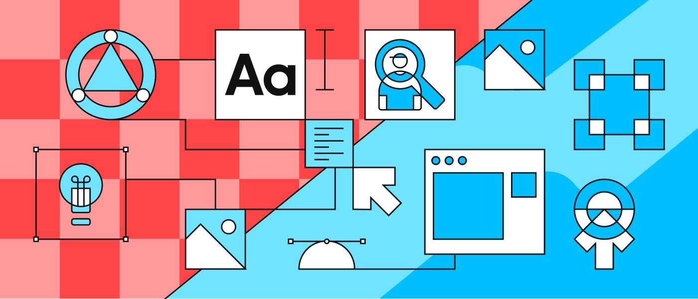
High fidelity means the prototype looks and feels close to the final product. Visual style, spacing, typography, real content, and realistic interactions are all part of the package.
In high fidelity, the UI is no longer a wireframe. It’s a simulation of the product experience. That makes it great for usability testing, stakeholder sign-off, and design-to-dev handoff.
In regulated spaces like banking, high fidelity also helps teams review compliance-heavy screens. When copy, field labels, and warnings appear realistic, it’s easier for legal, risk, and security teams to provide informed feedback.
High Fidelity Prototyping in Practice
High-fidelity prototypes are crucial because they incorporate real UI elements, brand guidelines, and detailed interaction logic. Components like inputs function realistically, error states are present, and flows account for real-world scenarios such as "forgot password" or "retry payment."
At this level of detail, microinteractions become significant. Elements like loading indicators, confirmation messages, and subtle transitions heavily influence a flow's perceived trustworthiness, which is particularly vital in mobile banking app design due to the handling of sensitive user data.
Furthermore, high fidelity enables teams to test the "full funnel." For instance, an onboarding process might involve critical steps like Know Your Customer (KYC) checks, document uploads, and consent screens. A highly polished prototype makes it easier to pinpoint potential drop-off points and refine the experience before development even begins.
Advantages and Limitations of High Fidelity Prototypes
High fidelity prototypes are powerful because they reduce uncertainty. They help teams see what they’re actually going to ship, and they make user testing more realistic.
They also come with real trade-offs:
- They take more time to build and maintain
- Stakeholders may treat them as “final,” even when things are still changing
- Teams can over-invest in polish before the flow is proven
- Late changes can be expensive if the prototype is very detailed
A simple rule works well: use high fidelity when decisions depend on details. If the choice is about layout and sequence, lo-fi is enough. If the choice is about clarity, trust, and interaction, hi-fi pays off.
Common Mistakes When Choosing Prototype Fidelity
One common mistake is investing in high fidelity too early. Teams do it because polished screens feel like progress, but the risk is that you “lock in” a flow that has not been tested properly.
Another mistake is staying in low fidelity for too long. You can get agreement on a wireframe flow, then find out in hi-fi that the UI becomes cramped, content does not fit, or key states were never designed.
A third issue is a mismatch of fidelity to the audience. Executives may not understand lo-fi enough to give helpful feedback. On the other hand, engineers often prefer lo-fi early because it makes scope and logic clear without design noise.
A healthier pattern is a planned ladder: lo-fi to explore, mid-fi to structure components, hi-fi to validate the final experience, then build.
Lo-Fi vs Hi-Fi Prototyping
Create your prototype with ff.next!
If your product is UI-heavy, prototype choices directly affect delivery speed. When teams want pixel-accurate builds from validated prototypes, the prototype itself needs to be build-ready, not only nice to look at.
At ff.next, we treat fintech product design and UI-heavy development as one connected workflow. We run UX research, shape flows, and design high-fidelity UI with a tight design-to-dev handoff so the shipped product actually matches the vision.
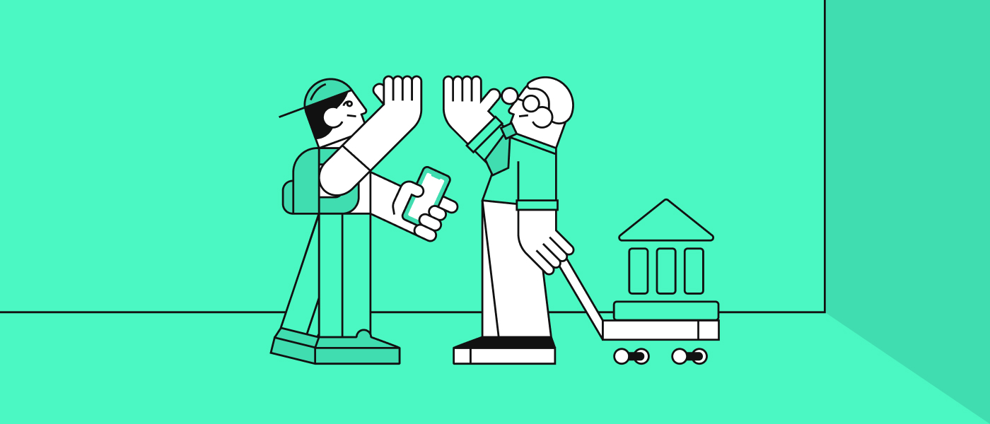
We contributed to OTP Bank’s youth banking strategy through deep UX consultancy. To ensure their innovative features would actually resonate with a younger demographic, we built several high-fidelity prototypes and conducted rigorous usability tests. By validating these solutions early in the process, we saved months of development time and ensured the final product was market-ready from day one.
We work globally, with delivery experience across 20+ countries. This is vital when your product needs to adapt to different regional regulations, languages, and user expectations.
If you’re planning a new build or a redesign and you want a prototype that turns into a pixel-accurate product, we can help.
Ready to start? Visit our contact page to book a 30-minute scoping call or request a ballpark quote. Share details about your project, the obstacles you're facing, and your vision of success, and we'll collaborate with you to define a practical roadmap.
Frequently Asked Questions
What does low fidelity mean in UX design?
Low fidelity in UX design means simple representations of screens and flows. The goal is to validate structure and user steps without spending time on visuals.
It helps teams find problems early, when changes are cheap. It also keeps feedback focused on usability basics like clarity and flow.
What is the high fidelity meaning in design projects?
High fidelity means the prototype closely matches the final UI. It includes branding, real components, real content, and realistic interactions.
Design projects use hi-fi when decisions depend on details, or when the prototype needs to guide development with minimal guesswork.
When to Use Low-Fidelity vs High-Fidelity Prototype in the Design Process?
Use low fidelity when you are still deciding what to build and how users move through it. It’s best for early discovery, workshops, and fast iteration.
Use high fidelity when you need to test the experience, get sign-off, or prepare for build. In banking app UX, hi-fi is often needed before development because trust and clarity depend on details.
Is high-fidelity prototyping necessary for usability testing?
Not always. You can run strong usability tests with lo-fi if you’re testing flow, labels, and navigation.
High fidelity becomes more important when you’re testing trust, comprehension, and interaction details. That’s common in fintech, where users are making money decisions and sharing personal data.
How do low-fidelity sketches support early validation?
They make it easy to explore multiple options quickly. You can compare flows, remove steps, and spot missing states without getting stuck in UI polish.
They also make group feedback easier. People feel more comfortable challenging a sketch than a polished design, which leads to better early decisions.