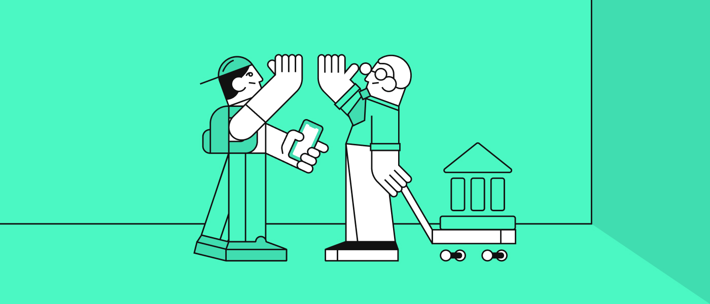
Fintech Landing Page Design Service
Fintech landing pages are high-stakes conversion assets where trust, clarity, regulation-aware messaging, and UX all shape both lead quality and conversion performance. This guide covers best practices, what a professional service should include, and how to avoid the most common mistakes.
Fintech Landing Page Design Service
Fintech landing pages are high-stakes conversion assets where trust, clarity, regulation-aware messaging, and UX all shape both lead quality and conversion performance.
Why fintech landing pages need a specialized design approach
A fintech landing page has to do more than look polished. It needs to make a serious offer feel credible within seconds, often to buyers who are cautious, comparison-driven, and used to reading the fine print. In financial services, weak messaging or a generic layout can create doubt fast.
That is why fintech product design needs a different mindset from general marketing design. The page has to support conversion, but it also has to feel measured, clear, and dependable. For banks, fintechs, and B2B financial platforms, that balance is where strong landing page performance starts.
Trust signals and credibility elements
Trust is one of the main drivers of landing page performance in fintech. Visitors want proof that your company is real, established, secure, and capable before they share data, book a demo, or start an application.
Useful trust signals often include client logos, ratings, case study metrics, security statements, certifications, partner badges, press mentions, and clear company details. These elements work best when they are placed naturally across the page instead of being packed into one section without context.
A strong fintech landing page also avoids overclaiming. Specific proof works better than broad statements. “Used by teams in 20+ countries” or “cut onboarding drop-off with a clearer mobile flow” gives visitors something concrete to hold onto.
Compliance-aware messaging and visual presentation
Fintech pages need persuasive copy, but they also need restraint. Offers related to money, lending, payments, investing, or identity checks must be explained carefully, with wording that is accurate and easy to understand.
This affects both copy and design. Claims should be transparent, disclaimers should be readable, and important information should not be hidden behind visual tricks. A good page still sells, but it does so with language and structure that respects how financial buyers assess risk.
That is especially important when a page is part of a wider mobile banking app design or product launch. The landing page often sets the tone for the whole experience, so the visual presentation needs to feel aligned with the product that comes next.
Fintech landing page design best practices
The best fintech landing pages are simple in structure, focused in message, and strong on proof. They reduce friction, not by removing useful detail, but by organizing it well.
A good framework usually includes:
- a clear headline and audience fit
- strong proof close to the first call to action
- a focused path from value to trust to action
- mobile-first layouts with fast performance
These basics sound simple, but execution matters. In UI-heavy development work, small interface details often shape whether a page feels premium and reliable or rushed and generic.
Clear above-the-fold value proposition
The hero section should tell visitors what the offer is, who it is for, and why it matters. That message should be easy to scan and supported by clean visual hierarchy, not crowded with too many competing ideas.
For fintech audiences, a good hero usually pairs a direct headline with one supporting line, one primary action, and a product visual or UI preview that feels real. This is where pixel-accurate builds matter. If the design looks vague or unfinished, trust drops before the visitor reads the second section.
Conversion-focused layout and user flow
A landing page should guide the visitor through a clear sequence. First, explain the offer. Next, build trust. Then answer key objections. After that, ask for action. When sections are out of order, even a good offer can feel harder to understand.
This is where banking app UX thinking becomes useful even on marketing pages. Financial products often involve more caution, more questions, and more internal approval. The layout needs to support that decision process without becoming long, repetitive, or hard to scan.
One example is a lending platform that needed more qualified demo leads. Instead of sending traffic to a dense product page, we helped shape a focused landing flow with clearer audience targeting, stronger proof, and fewer competing actions. The result was a cleaner path to booking and more relevant inbound conversations.
Strong calls to action for fintech audiences
Calls to action should be direct, specific, and matched to the visitor’s stage. “Book a demo,” “Get a ballpark quote,” or “Talk to a product specialist” usually works better than vague phrases that ask for commitment without context.
Good CTA design also includes reassuring microcopy. A short line like “30-minute call,” “No obligation,” or “We can sign an NDA” can reduce hesitation without adding clutter. In fintech, lowering perceived risk is often just as important as increasing motivation.
Mobile-first UX and page performance
A fintech landing page has to work well on mobile. Buyers may first see it from an ad, a LinkedIn post, or a forwarded message. If the page is slow, hard to scan, or awkward on smaller screens, campaign performance drops fast.
Mobile-first design is also about clarity, not only responsiveness. Text has to remain readable, buttons need comfortable spacing, and forms should feel light and manageable. For teams investing in mobile banking app design, the landing page should reflect the same care as the product itself.
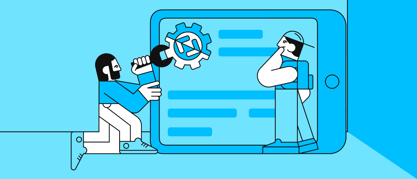
What a fintech landing page design service should include
A professional service should cover more than visual design. The strongest results come from connecting business goals, messaging, UX structure, and implementation from the start.
At FF Next, that usually means:
- research and conversion strategy
- UX wireframing and content planning
- visual design aligned to brand and product
- design-to-dev handoff for launch-ready delivery
This is especially important for UI-heavy development. A landing page is not done when the mockup looks good. It needs to translate cleanly into a live build that keeps the intended hierarchy, spacing, interactions, and credibility cues.
Research and conversion strategy
Before design starts, the team should understand the audience, traffic source, offer, and decision context. A page built for demo bookings needs a different structure from one built for app installs, partner leads, or investor interest.
Competitor review also matters. In fintech, many pages use the same language around speed, security, and innovation. The strategy work helps define what is actually distinctive so the design can support a sharper position.
UX wireframing and content planning
Wireframing helps solve the important questions before visual polish begins. It lets the team test structure, information order, and section logic while changes are still fast and low risk.
This is also where design and copy start working together. The best landing pages do not treat messaging as filler added later. Strong UX/UI agency for banks work depends on section-level thinking, where content and layout reinforce each other from the start.
Visual design tailored to the fintech brand
Visual design should reflect the maturity of the product and the expectations of the audience. Typography, spacing, color use, and component consistency all shape whether the page feels trusted enough for a financial decision.
This is one of our core strengths at FF Next. We specialise in UI-heavy development that turns validated prototypes into pixel-accurate builds, with close design-to-dev handoff across research, UX/UI, and implementation. That matters when a landing page needs to match a wider product ecosystem, from web dashboards to mobile journeys and white-label fintech modules.
Copy collaboration and section-level messaging
Landing pages work best when design and messaging are developed together. A good designer can improve clarity through hierarchy and layout, but weak copy will still limit performance.
That is why section-level messaging should be shaped as part of the process. A short proof block, a sharper headline, or a more specific objection-handling section can make a big difference. In one recent case, a financial product team had a strong offer but weak explanation. Reworking the page structure and message around the actual buying concerns helped lift engagement and made sales conversations easier to qualify.
Agency vs freelance fintech landing page designers
Both agencies and freelancers can do strong work, but the right choice depends on project scope, internal capability, and delivery risk. The more complex the page, the more important the full workflow becomes.
If your project needs only visual execution on top of a solid brief, a freelancer may be enough. If it needs research, messaging, UX, UI, implementation thinking, and CRO support, an agency is often the safer fit.
When an agency is the better fit
An agency is usually a better option when multiple skills need to come together. That includes campaign strategy, UX structure, branded UI, copy collaboration, and development-ready handoff.
This is especially true in fintech, where product complexity is higher and details matter more. FF Next works with banks and fintechs across 20+ countries, with deep domain experience in banking, youth banking, and white-label fintech modules that help teams move faster without sacrificing quality.
When a freelance designer is the better fit
A freelancer can be a strong choice for a smaller page, a simpler offer, or a team that already has strategy and copy in place. It can also work well when speed matters and the scope is tightly defined.
The trade-off is usually around depth and coordination. If questions come up around messaging, CRO, or implementation, the project may need more support than one person can comfortably provide.
How to choose based on project scope and risk
The best choice depends on how much is already solved and how costly mistakes would be. If the landing page supports a major launch, paid campaign, or strategic product push, the safer route is usually the team that can cover more of the journey well.
Look at specialization, revision process, delivery quality, and handoff strength. In fintech product design, the value is rarely just in making the page look good. It is in reducing ambiguity and improving the odds that the page performs once traffic arrives.
Fintech landing page design cost and timeline
Landing page cost depends on the amount of thinking, design depth, and implementation detail involved. A simple campaign page is very different from a conversion-focused page tied to a complex product, multiple stakeholders, and compliance review.
Most solid projects move through discovery, wireframes, visual design, revision rounds, and handoff. The timeline can be short when the offer is clear and approvals are fast, but it stretches when messaging is still unsettled or the scope keeps changing.
What influences fintech landing page design cost
The biggest cost drivers are complexity, copy support, custom visuals, CRO input, number of sections, revision rounds, and whether dev-ready assets are needed. Pages that need polished product visuals, interaction notes, or several audience variants will naturally require more work.
That is why clear scoping matters. It helps both sides align on what is included and where the biggest value will come from.
Typical project phases and timeline expectations
A typical flow starts with discovery and messaging alignment, then moves into wireframing, visual design, revisions, and handoff. For some teams, launch support or implementation review is also useful.
When the work includes a strong design-to-dev handoff, development tends to be smoother. That matters a lot in UI-heavy development, where small differences between the prototype and the live build can change how trustworthy the page feels.
How to avoid delays and scope creep
The easiest way to keep a project moving is to define goals, deliverables, stakeholders, and approval steps early. Delays often come from unclear ownership, late feedback, or changing the page objective mid-project.
It also helps to gather brand assets, proof points, screenshots, and compliance-reviewed claims before design starts. Good preparation shortens decision cycles and improves the final result.
Common mistakes in fintech landing page projects
Many underperforming fintech landing pages have the same problems. The design may look polished, but the message is vague, the proof is thin, or the CTA path is unclear.
The most common issues are:
- generic messaging that could fit any industry
- overdesigned layouts with weak conversion focus
- missing reassurance around trust, security, or proof
These are usually fixable, but they are much easier to prevent than to patch after launch.
Generic messaging that could fit any industry
If the page says only “modern finance made simple” or “next-generation banking experience,” it risks sounding interchangeable. Buyers need to know what is actually being offered and why it matters to them.
Specificity is what creates traction. Clear audience fit, concrete benefits, and grounded proof make a page feel more credible and more useful.
Overdesigned pages with weak conversion paths
Heavy visual effects can distract from the main action. In fintech, that is a bigger problem because visitors are already processing more caution and more detail than they would on a lifestyle or retail landing page.
The page should feel refined, not overloaded. Strong hierarchy, clean components, and a focused path usually outperform decorative complexity.
Missing proof, clarity, or reassurance
A landing page can look attractive and still fail because it does not answer the questions visitors care about. Is this company credible? Is the offer real? Is the next step low risk? Why should I trust this team?
Those questions need visible answers. Proof, clarity, and reassurance are not secondary details in fintech. They are part of the core conversion system.
What to prepare before hiring a fintech landing page design service
The better your input, the stronger and faster the project will be. Teams get better results when they come in with clear goals, available proof, and a defined approval process.
That does not mean everything has to be final. It just means the core business context should be clear enough for the page to be shaped with confidence.
Business goals and campaign objective
Start with the main goal. Is the page meant to drive demo bookings, app installs, qualified leads, webinar signups, or something else? That decision shapes the entire structure.
Without that clarity, it is easy for the page to become too broad. A focused conversion objective creates better design decisions from the first wireframe onward.
Brand assets, offer details, and proof points
Helpful inputs include logo files, brand rules, product screenshots, customer quotes, metrics, partner logos, and approved claims. These materials save time and make the page more credible.
If the product includes white-label fintech modules or boxed components, that should also be clear early. It often becomes a strong selling point, especially for teams trying to speed up go-live.
Internal approval process and stakeholders
Knowing who signs off on copy, design, and compliance review can prevent weeks of friction later. Fintech teams often involve product, marketing, legal, and leadership, so approval planning matters more than many teams expect.
A clean approval path protects both quality and timeline. It also reduces the chance of the page becoming a compromise between too many competing opinions.
Frequently Asked Questions
What makes a fintech landing page different from a standard landing page?
It has to balance conversion with trust, clarity, and careful messaging. Financial audiences are more cautious, so proof, tone, and structure matter more.
How long does a fintech landing page design project usually take?
It depends on scope, but most projects move through discovery, wireframes, visual design, revisions, and handoff. Clear inputs and fast approvals make a big difference.
Should I hire an agency or a freelance fintech landing page designer?
Choose based on scope and risk. A freelancer can work well for a smaller, clearly defined page. An agency is often better for projects that need research, copy collaboration, UI design, and strong handoff.
What affects fintech landing page design cost the most?
The biggest factors are complexity, messaging support, number of sections, custom visuals, CRO input, revision rounds, and whether launch-ready or dev-ready assets are needed.
What sections should every fintech landing page include?
At minimum, it should include a clear value proposition, trust signals, explanation of the offer, proof, objection handling, and a focused call to action.
If you are planning a fintech landing page and want it to feel sharp, credible, and launch-ready, FF Next can help. We work end to end from UX research to UX/UI to implementation, with deep banking expertise, global delivery across 20+ countries, and a strong design-to-development handoff. You can book a 30-minute scoping call or request a ballpark quote through our services and contact pages.