
The Elements Of A Well-Designed Website

Learn the key elements of a well-designed website, from intuitive navigation and responsive layouts to engaging visuals and optimized performance.
The elements of a well-designed website
Thinking of building a website? Then you're probably wondering how to make it visually appealing and useful. A well-designed website isn’t just a digital business card—it’s your 24/7 salesperson, lead generator, customer support rep, and brand ambassador, all rolled into one. To build something that works, you must pay attention to structure, usability, accessibility, and aesthetics. This guide walks you through the key elements that make a website stand out—and perform.
How to create a successful website?
Designing a website that users love and return to again and again is not about flashy features or the latest trends. It’s about purposeful design, clarity, and engagement. Here are the essential pillars every successful website needs.

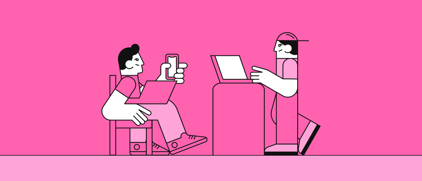
Audience & User research
Creating user personas and customer journey maps helps you anticipate how visitors will interact with your site, what they expect to find, and what might stop them from converting. When you design with real users in mind, not assumptions, you’re far more likely to craft an intuitive, satisfying, and successful experience.
Purpose
Before picking colors or sketching wireframes, you must ask yourself one big question: Why is this website being built? A clear and focused purpose should guide every design and content decision.
Is it meant to inform? Sell? Educate? Collect leads? When your site tries to do everything, it risks doing nothing well. A purposeful website connects its objectives to the user's intent, making the journey logical and satisfying.
Minimalist design
A cluttered design is like a noisy room—you can’t focus on what matters. A minimalist layout uses white space, clean lines, and carefully chosen content to draw attention where it matters most.
That doesn’t mean “boring”—it means intentional. Every image, line of text, and button has a job. This simplicity improves aesthetics, usability, and performance, particularly on mobile devices.
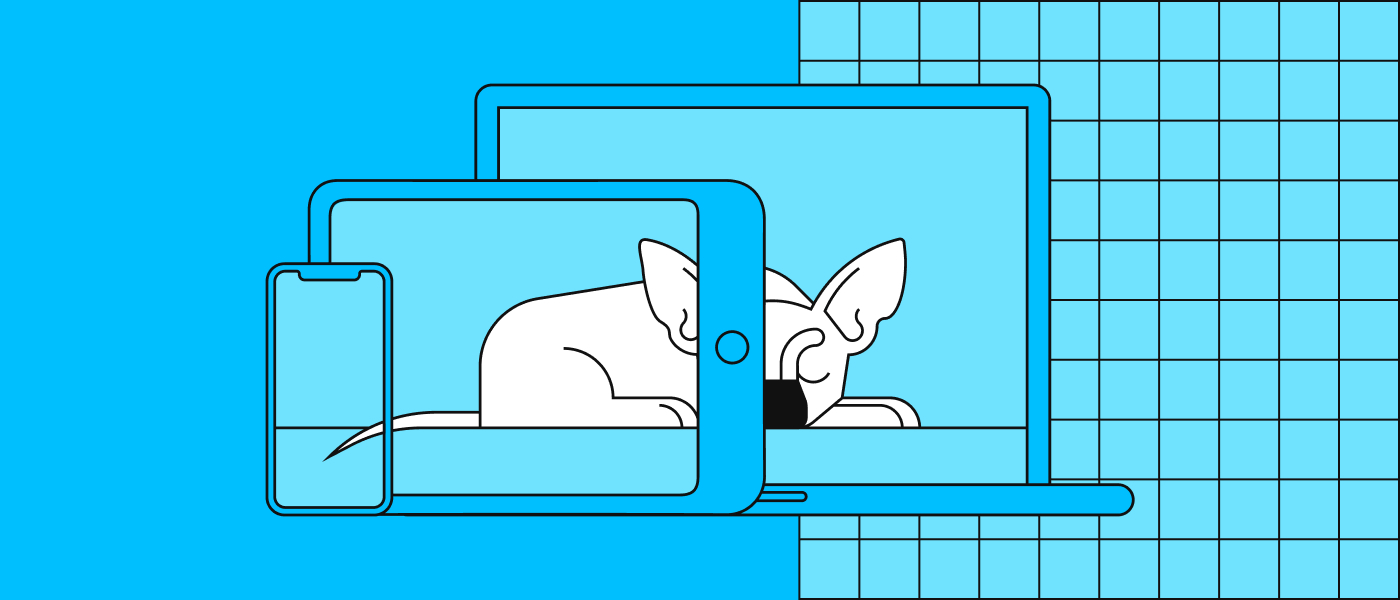
Designing for all screens: mobile-first and responsive design
More than half of all web traffic today comes from mobile devices, yet many websites still prioritize the desktop experience first. That’s a huge mistake. Mobile-first design means starting your layout with the smallest screen in mind and progressively enhancing it for larger displays. It forces you to simplify, prioritize content, and make smarter UI decisions early.
Responsive design takes this further by ensuring your site adapts seamlessly across devices and screen sizes. Using fluid grids, scalable images, and CSS media queries, you can deliver a consistent, polished experience whether someone visits on a phone, tablet, laptop, or widescreen monitor. A site that isn’t mobile-friendly isn’t just frustrating—it’s a liability.
User-friendly navigation
Even the most beautiful website fails if users can’t find their way around. Navigation should be intuitive and predictable. Menus must be clear, labeled with familiar terms, and consistent across pages.
A good rule of thumb? If a user can’t find something in 3 clicks or less, rethink your structure. Breadcrumbs, sticky headers, and search bars all help users stay oriented.
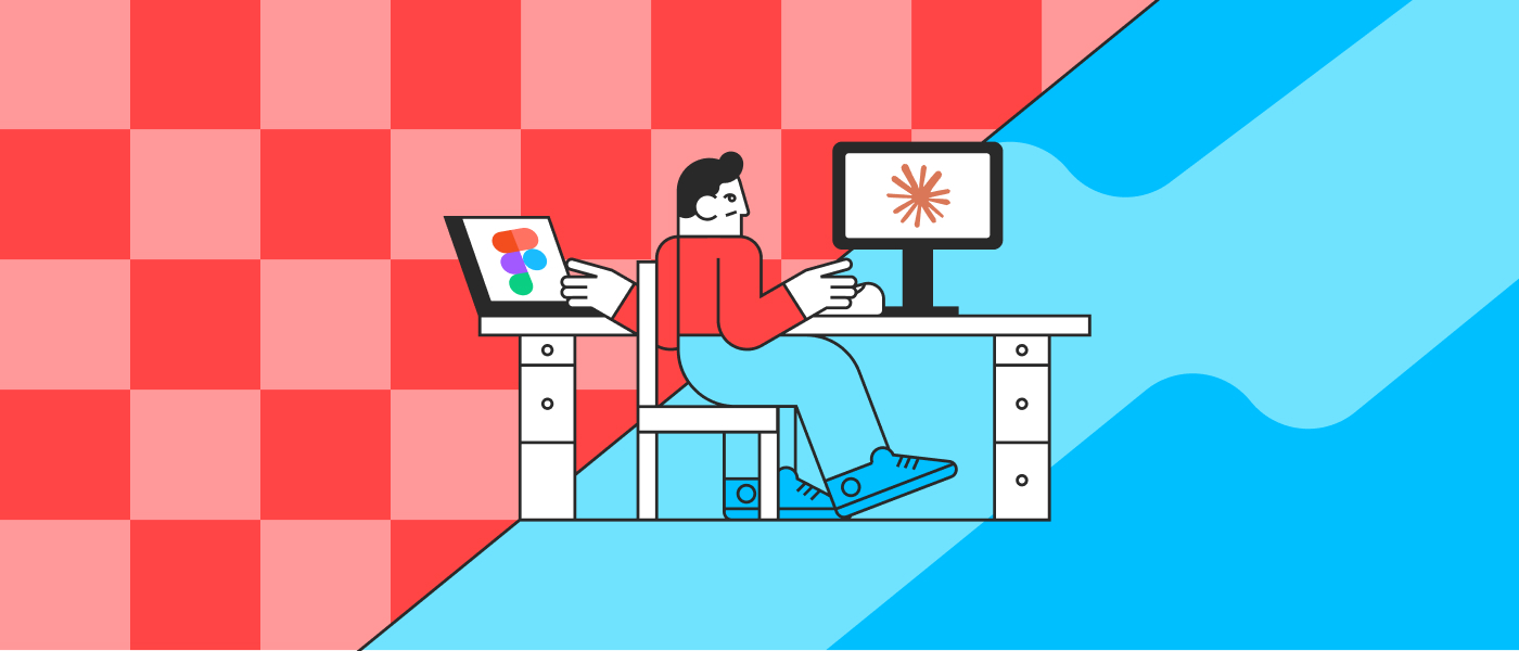
Stunning visuals
We’re visual creatures—an engaging image or dynamic video can tell a story faster than paragraphs of text. High-quality visuals create emotional connections, build trust, and help guide user action.
However, quality matters more than quantity. One hero image that perfectly communicates your brand message is more effective than a carousel of generic stock photos.
Organization
Think of your site like a well-arranged room: users should instantly feel where they’re supposed to go. Hierarchical content structure, precise sectioning, and visual balance contribute to a well-organized experience.
Use headings, subheadings, grid layouts, and consistent design patterns to help users consume your content comfortably, without confusion or fatigue.
Accessibility
A truly user-centric website is accessible to everyone, including those with visual, auditory, or cognitive challenges. That means readable fonts, alt text for images, keyboard navigation, and color contrast compliance.
Not only is this good practice, it’s legally and ethically necessary. An inclusive site respects all users, building a more loyal and diverse audience.
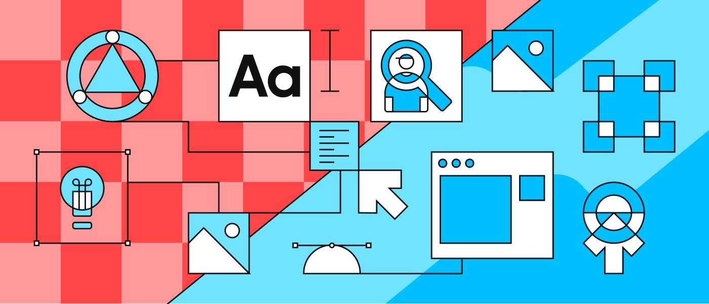
Website design elements to use
Now that we’ve covered the strategy, let’s explore the building blocks—the visual and interactive components you’ll actually use to shape your site.

Hero
The hero section is your first impression—make it count. It typically includes a bold image or background, a punchy headline, and a call to action (CTA).
Why it matters: It grabs attention, clarifies what the site is about, and nudges users toward their next step. A good hero section can increase the page time and reduce the bounce rate.
Buttons
Buttons are the bridges between content and action. A well-placed, clearly labeled button can significantly boost conversion rates.
Why it matters: Users need guidance, not just information. CTA buttons like “Get started”, “Download guide,” or “Schedule a call” tell people exactly what to do next. They should be visually distinct and accessible.
Dividers
Dividers are subtle, but powerful tools. They help segment content without cluttering the design.
Why it matters: When used well, they guide the eye and support visual hierarchy, helping users distinguish between sections or ideas.
Images
Beyond decoration, images communicate mood, identity, and values. Custom or branded visuals work best, but even well-chosen stock images can enhance professionalism.
Why it matters: The right image can explain a concept faster than text. It can also help establish emotional tone and reinforce trust in your brand.
Forms
Whether it’s a newsletter sign-up or a product inquiry, forms are where users convert from visitors to leads.
Why it matters: Poorly designed forms significantly cause user drop-off. Keep them short, logical, and visually simple. Use smart defaults, inline validation, and progressive disclosure where necessary.
Typography
Typography goes far beyond choosing a nice font. It’s about readability, tone, and structure.
Why it matters: Well-chosen typography reflects your brand’s voice—playful, serious, elegant, or bold. Clear visual hierarchy, proper spacing, and contrast keep users engaged.
Animations
Micro-interactions—like a button that pulses when hovered, or a menu that slides in—can make a website feel alive.
Why it matters: Thoughtful animation guides users, rewards interaction, and makes the interface feel more intuitive. But be careful: too much animation can be distracting or frustrating.
Add trust-building elements
Even if your content is perfect and your design is gorgeous, users won’t convert if they don’t trust you. That’s why trust-building elements are non-negotiable. Social proof, like testimonials, ratings, and client logos, shows that others have benefited from your product or service. Trust badges, like security seals, payment icons, or certifications, signal legitimacy.
Clear privacy policies, terms of use, and contact information also matter more than most think. On top of that, consistent branding, professional copy, and fast loading times all subtly reinforce your credibility. A trustworthy website is one that users feel comfortable spending time on and money with.
Summary: a list of the most crucial website elements
To recap, here’s a shortlist of what matters most when designing a website that works:
- Clear purpose: define it before anything else
- Minimalist design: clarity beats clutter
- Easy navigation: guide your visitors, don’t confuse them
- Engaging visuals: show, don’t just tell
- Firm structure: helps users move naturally through the content
- Accessible design: make your site usable for everyone
- Essential UI elements: like hero sections, buttons, images, and forms
These are not just nice-to-haves—they’re essential if you want your website to perform well and provide real value to visitors.
Need help designing or evaluating your website? Don’t hesitate to reach out to our team. Whether you’re starting from scratch or need a design refresh, we’re here to guide you every step of the way.

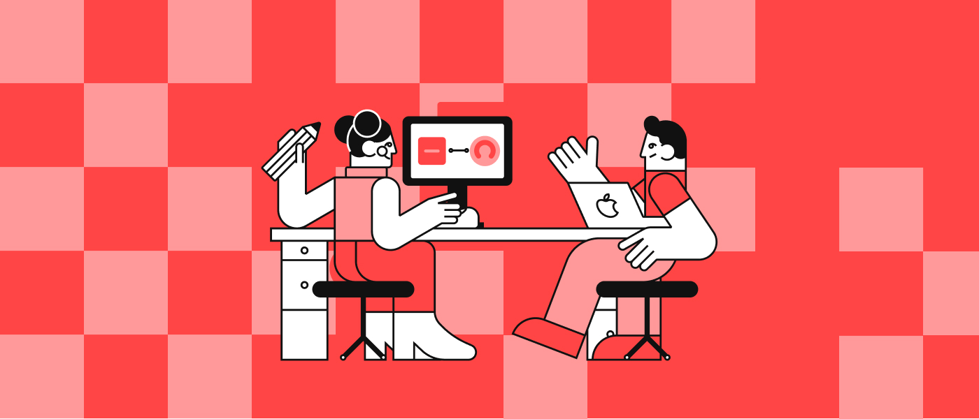
P.S.: How do you brief a web designer or agency effectively?
If hiring a designer or agency, your project brief will make or break the process. An intense brief isn’t just a list of features—it’s a clear articulation of your business objectives, target audience, desired outcomes, and content needs. Start by outlining your brand’s tone, values, and competitive landscape. Include examples of websites you admire and explain what works about them. Be specific about functionality—whether you need forms, booking systems, multilingual support, or integrations with other tools.
Don’t forget timelines and budget constraints either. A thoughtful brief sets expectations, fosters smoother collaboration, and gives the design team a solid foundation for creative problem-solving.


