Webpage Interface Design That Works: 9 Examples

Discover the essentials of webpage interface design. Learn from great UI examples and see how user-friendly layouts enhance online experiences.
Webpage Interface Design That Works: 9 Examples
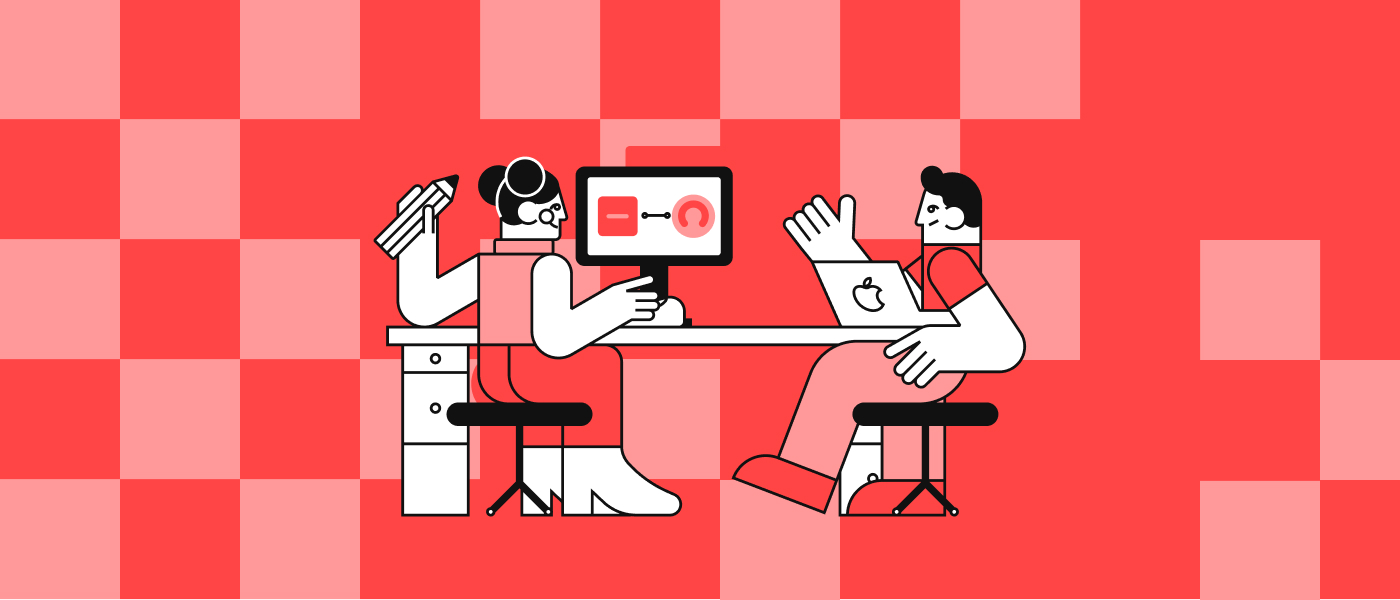
In today's digital age, the interface is the handshake between a website and its users. With countless platforms competing for attention, designing a well-functioning, intuitive, and beautiful UI can make all the difference. In this guide, we'll explore what makes interface design effective, show you some of the best examples, and give you practical tips to start designing your standout webpage.
What is webpage interface design?

Webpage interface design (often referred to as UI design) is the process of creating a website's visual layout and interactive elements. The goal is to make the user’s journey through the website smooth, efficient, and even enjoyable. It's not just about looking good—a great UI helps users achieve their goals with minimal friction.
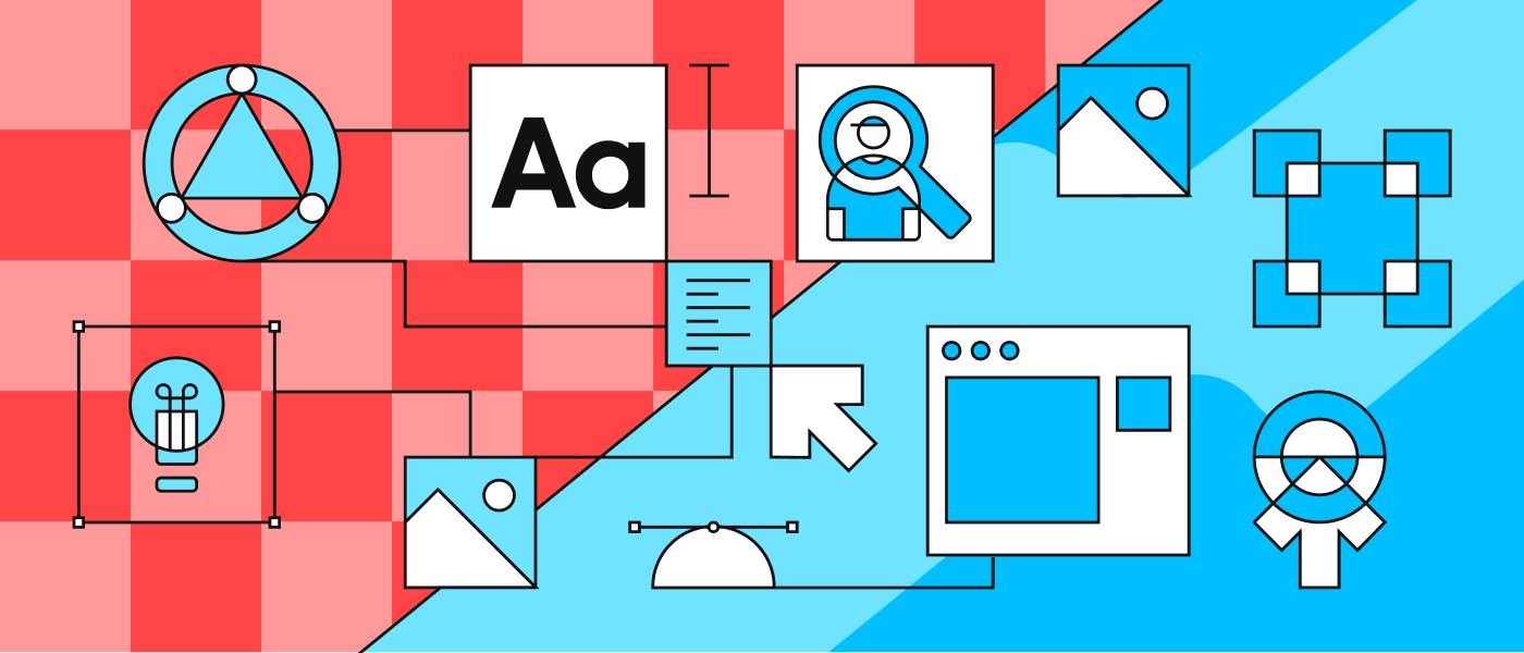
Basic elements of good UI
A successful interface blends form and function. At its core, good UI involves:
- Layout: Content should be organized logically and visually. Grids help create balance and alignment.
- Typography: Font choices must be legible, appropriately sized, and aligned with brand tone.
- Colors: Use a coherent color scheme with enough contrast to ensure readability and draw attention where needed.
- Visual hierarchy: Elements should naturally guide the user's eye through the page—from headline to CTA.
These elements work harmoniously to create a site that feels easy to use and visually cohesive.
Best website UI examples
To understand UI design at its best, let’s look at real-world websites that excel in this field.
What makes them successful?
The top websites prioritize the user. From responsive layouts to smart microinteractions, their UIs are designed to remove confusion and enhance flow. Clarity, feedback, and consistency are all key traits you'll see in the examples below.
Apple

Apple's website is a masterclass in minimalism. The layout is clean with generous whitespace, and the navigation is intuitive without being overwhelming. The bold, elegant, and consistent typography echoes the brand's identity.
Dropbox

Dropbox combines simplicity with strategic use of whitespace and iconography. Their UI flows naturally, with clear action paths and friendly illustrations that make even technical steps feel approachable.
Medium

Medium focuses on pure readability. With a clean, distraction-free design, the content takes center stage. Thoughtful typography and subtle animations make reading a joy.
Airbnb

Airbnb’s strength lies in its user-first design. The interface offers powerful yet intuitive filters, responsive grids that adjust to any device, and helpful visuals that guide the user through their journey.
Behance

Behance's UI is all about showcasing visuals. Their modular grid layout and smooth transitions make it easy to browse creative portfolios. The interface fades into the background, letting the content shine.
Stripe

Stripe's interface balances developer-friendly complexity with design elegance. Clear documentation, subtle animations, and a strong grid system make it feel professional and inviting.
Slack

Slack’s brand personality shines through its UI. From the bold color palette to playful icons, every element is cohesive. Navigation is fast, and responsive design ensures consistency across platforms.
Headspace

Headspace uses calm colors and friendly illustrations to create a welcoming environment. CTAs are well-placed and straightforward. The UI supports a soothing, low-stress user experience, in line with its meditation app purpose.
Mailchimp

Mailchimp balances fun and functionality with clever onboarding flows and UI feedback. Their illustrations and bold type create an approachable, easy-to-understand experience.
Types of web interfaces
Different website purposes call for different interface structures. Blogs, landing pages, and e-commerce platforms all have unique needs.
Web interface examples across categories
- Blog: Focuses on readability and precise content categorization (e.g. Medium).
- Landing page: This page highlights a single goal with strong CTAs and often minimal navigation (e.g., Stripe product pages).
- E-commerce: Needs smart filtering, quick loading, and detailed visuals (e.g. Airbnb, Apple).
Understanding the goal of a webpage is key to designing its interface.
What makes a user-friendly website?
To be truly user-friendly, a website should:
- Be mobile responsive
- Load quickly
- Use clear and consistent CTAs
- Minimize cognitive load with predictable patterns
- Offer feedback (like hover states or confirmation messages)
These principles help reduce user frustration and increase engagement.
Which interface do users like best?

There's no universal favorite—users are diverse. Preferences vary based on taste, device, and familiarity. However, usability tests consistently show that clarity, responsiveness, and visual consistency are universally appreciated. Trends also matter: dark mode, micro animations, and personalization are currently popular.
How to design a great webpage interface
If you're just getting started, here are practical steps:
- Define your audience and goals
- Sketch user flows
- Create wireframes before jumping into visuals
- Choose a limited, harmonious color palette
- Use grids to maintain visual balance
- Test early and often on different devices
The best interfaces aren’t built overnight. They're tested, refined, and always improving.
We can help you!
Want a UI that users love to use? Whether you’re building a product site, portfolio, or app interface, our design team can help craft a beautiful and practical UI tailored to your goals. Let’s make something great together.
F.A.Q.
What are the key elements of a well-designed web interface?
Typography, color, layout, and hierarchy—all optimized for user clarity and consistency.
What makes a website user-friendly?
Clear CTAs, fast loading, mobile responsiveness, and a structure that matches user expectations.
How can I improve my website's UI design?
Start with a usability review, focus on simplifying navigation, and use visual hierarchy to guide actions.
What's the difference between UI and UX?
UI is the look and interactive feel of a website. UX (user experience) includes UI but also covers structure, flows, and emotional impact.
What tools are used for interface design?
Popular tools include Figma, Adobe XD, Sketch, and prototyping platforms like InVision or Webflow.