Top UI design trends you should know about to conquer users’ hearts

We collected the most recent UI design trends to help you understand where designers get their inspirations from.
Introduction
Do you sometimes wonder what the hottest and most recent design trends are that professionals follow in order to create stunning, pixel perfect interfaces? If the answer is yes, you may stop looking because we collected the most recent ones here to help you understand where designers get their inspirations from. In this article we will address the following trends:
- Minimalism
- Brutalism
- Skeuomorphism
- Neuomorphism
- Dark mode
- 3D elements
- Scrollytelling
- Animation
- Kawaii
Minimalism
Minimalism is a simple yet powerful concept in web design, as it is based on using neutral colours and smaller objects that occupy extended space. Thus, with the help of the minimalist design we can create interfaces that do not only look clear and professional but save a great amount of resources as they can be developed in a shorter amount of time unlike more complex ones. By removing all sources of distraction and maintaining attention on what matters the most, the message will be made clearer. While doing so, redundant components must be eliminated, and a clear focus point must be established. The user should be able to navigate without getting lost, confused, or overwhelmed, so the goal is to combine design with functionality in the simplest way feasible, while all extraneous components must be removed.1 The following image illustrates a typical minimalist UI design:

Brutalism
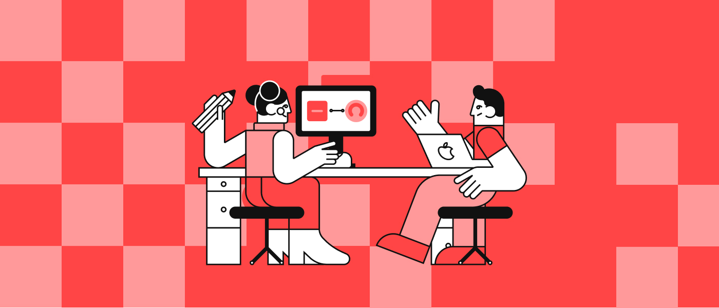
Web-brutalism originates from the brutalist architectural style, which was dominant between the 1950s and 1980s and is characterised by the following attributes: raw, uncomfortable, bold, ugly, unbothered, reactionary. The brutalist movement was created by younger generations in order to disrupt the mainstream design trends. When creating a website with brutalist design, aesthetics and beauty is one of the last things you should consider.2 Similarly to the minimalist approach, brutalism also operates with simple appearance and all of its design elements must have a clear purpose. There are some distinct characteristics of a brutalist design that help you identify it. Such traits include: monochromatism, raw text, no gradients, geometric components, underlined hyperlinks, etc. One of the best examples for the brutalist web design is Craigslist’s website3:

Skeuomorphism
Skeuomorphism is a really exciting design concept as its main principle is to define UI objects by mimicking their real-world counterparts. It does not only copy the appearance of the objects but also mimics how users can interact with them. The purpose of skeuomorphism is to create intuitive design elements, thereby helping users to understand the interface better. The best examples of skeuomorphic design are the UI elements of the early iOS designs.4 Although Apple switched to the flat design in recent years, the following mockup illustrates well the differences between the two concepts:

Neuomorphism
Neuomorphism is considered to be the “new wave” of the previously mentioned skeuomorphic design. Neuomorphism can be characterised as falling somewhere between a "lifeless" and a "realistic" representation of an item. The pros of using this concept is that neuomophism can bring freshness to your website and make your UI stand out of the crowd. On the other hand, however, it has some disadvantages as well. A huge drawback for instance is that neuomorphic design elements are extremely hard to code, while it also has accessibility and visibility issues, as there is minimal or no contrast.5 The following mockup shows us what a neuomorphic design looks like:

Dark mode
I’m pretty sure that most of you have already heard about dark mode. It is a really popular design concept nowadays and many mobile and web applications use both light and dark themes on their interfaces. However, it is worth mentioning that not all UIs are suitable for dark mode as it greatly depends on the given app’s branding and other cultural and psychological factors. There are also some important rules to consider when it comes to design dark themed interfaces. First, dark mode doesn’t mean a full black theme, therefore the background colour rather should be dark grey, as it can better express contrast and depth. Secondly, when creating a dark themed interface, text contrast requires extra care as it heavily impacts the visibility of the UI. It is also really important that in order to avoid visual vibration on dark themes, designers should not use saturated colours when they are crafting the dark mode of a UI. And finally, one should leverage negative space, as poorly designed dark UI can make interfaces heavy and overwhelming.6 The following mockups compare the light and dark themes of an exchanging app’s interface:

3D elements
As the world is getting more and more digital, numerous brands and companies start to shift from the minimalist and flat design to more spectacular solutions, which often include 3D UI illustrations and elements. Creating 3D illustrations might be more difficult than 2D, as it requires 3D modelling softwares, however, it is definitely worth the effort! Why? Because using 3D elements on your website or app have several benefits, such as:
- 3D illustrations lead to a more realistic experience, which is more appealing to users
- It can generate new creative ideas and flows, as you can combine 2D and 3D elements
- Learning to create 3D illustrations can also help designers to expand their job opportunities7. By learning a new skill you can also extend your “design vocabulary”.
Below you can see how 3D illustrations can boost your website’s appearance:

Scrollytelling
Scrollytelling is one of the hottest trends in UI design nowadays. Though it has a long history, scrollytelling became increasingly popular only in recent years. But what is scrollytelling anyways, you could ask? Well, it is a visual representation of storytelling that uses scrolling in order to manage the pace of the story. One of its benefits is that with the help of scrollytelling designers can create an engaging way to tell a story. It’s also a big plus that users are not getting bombarded with excessive amounts of information, instead they can process the information in a fun, engaging and interactive way8, at their own pace.

Animation
Animations (or microinteractions) transform UI elements and components into interactive objects by adding visual effects. This interactivity fosters an engaging and delightful user experience while directing consumers around a website or digital product. The main purpose of UI animations is to direct visitors to a crucial CTA (Call-To-Action) or give them instructions on what they should do next. Designers can interact with users without using text thanks to UI animations. There exist 5 main types of UI animations: loading and progress, state changes, navigation, microinteractions, branding.9
Kawaii
The word “kawaii” comes from Japanese culture and it can be translated as “cute” in English. Accordingly, this design concept tries to give the user positive feelings and emotions, while also encouraging interaction. It contains several playful elements, such as rounded shapes, soft colours and modest typography. Although it originates from the Far East, the idea swiftly spread to Western nations, and many businesses have now begun to include its elements into their branding. The kawaii culture of Japan is another illustration of character in design. It can be found on anything from stationery to construction signs, scattered throughout the city. The aesthetic of kawaii is not just for kids; it is rather aimed at giving things - that might otherwise be uninspiring - a more laid-back, familiar, and welcoming vibe.10 The next mockup expresses well the essence of kawaii in UI design:

Conclusion
In this article we wanted to shed light on the most important, recent UI design trends. As you could see, there are many of them however, there are even more to explore, as new and new trends emerge constantly. There is no right or wrong answer when it comes to picking the proper design style or trend, although designers must always take extra care before beginning an interface design, as they have to consider a variety of factors, including usability and client expectations.
We hope that you found this blog post useful! Do not hesitate to follow us, so you won’t miss interesting stories in the future either. This article was provided by Bence Siklós, Business Analyst at ff.next. Melinda Havas, Head of Marketing & Business Development revised the content.
Sources
1 https://sympli.io/blog/the-art-of-minimalism-in-ui-design/
2 https://uxdesign.cc/brutalist-web-design-is-taking-over-the-internet-fee3c66139b5
4 https://www.interaction-design.org/literature/topics/skeuomorphism
5 https://hype4.academy/articles/design/neumorphism-in-user-interfaces
6 https://www.toptal.com/designers/ui/dark-ui-design
9 https://www.uxpin.com/studio/blog/ui-animation-examples/
10 https://vanschneider.medium.com/the-kawaiization-of-product-design-1f0b1269e1d4